Brands That Have Switched Logos in 2021

Rebranding

“Rebranding is a marketing strategy in which a new name, term, symbol, design, concept or combination thereof is created for an established brand with the intention of developing a new, differentiated identity in the minds of consumers, investors, competitors, and other stakeholders”.

Businesses are constantly focusing on evolving and steps to take their brand to the next level. A simple but effective statement to make is by redesigning your logo; this presents to audiences a shift in your business values.

In 2021 many of our famous brands have changed their iconic logos with mixed reaction, read on to find the biggest brands to refresh this year.

Burger King

Burger King is one of the dominating fast food companies and has one of the most recognised logos in the current era. Their logo has been the same since 1999 and is used worldwide throughout all their restaurants and their online profile.

Burger King rebranding in 2021 comes as a surprise to many. Their brand new campaign to change their logo worldwide has begun and restaurants, signage and online platforms have been transformed to represent the logo used in the 70s, 80s and 90s. The new logo comes as a cleaner, minimal design with a 3 colour palette.

“The new logo pays homage to the brand’s heritage with a refined design that’s confident, simple and fun”

What do you think of the new Burger King logo? Have they made the right decision to go retro? Or have they taken away what makes them easily recognisable?

Warner Brothers

Warner Brothers is a mass media and entertainment company which is a household name for most. Their logo is easily remembered when focusing on the brand and as is their theme music (Which is probably playing in your head right now).

Many fans were shocked and surprised as they revealed their new logo earlier this year. Initially, the logo was changed in 2019 but was officially shown in cinemas before “Locked Down” in January.

The new logo marks a completely new turn for the brand. With a new colour scheme stripping off the well-known gold design and replacing this with a clean and simple blue and white design. It is made to commemorate Warner Brothers 100 year anniversary in 2023.

Taking away such a familiar brand will always cause a mixed reaction and has caused much criticism via social media. Many fans took to platforms such as Twitter to react to the new design.

Vimto

Vimto is a leading soft drinks brand that has used the same logo for many years. Their logo is featured throughout all their products as well as through advertising and online.

The new logo captures this featuring a bolder, cleaner iconic V design to make the brand stand out more. It now features a “Since 1908” to mark their heritage of lasting 113 years.

Becky Unwin, Senior Brand Manager, Vimto, said: “We have worked hard to create a new visual identity for such an iconic and well-loved brand. We are confident that we’ve created something that not only speaks to our target market but also celebrates and communicates Vimto’s personality”

Peugot

A huge revamp to come from 2021 this year is Peugeot; they have had the same logo for 10 years and this new approach is very different to their previous designs.

The new design for their logo is a complete contrast to their popular branding featured across all vehicles, showrooms and online. It has a 2 tone palette of black and white and removes the lion’s body featuring only the lions head; this is the first time since 1975 this has been removed. The logo is made to resemble the 1960s emblem and mark a new turn of the company becoming a leading electronic vehicle supplier. It is said to show Peugeot as a more luxury and high end vehicle manufacturer.

“A new logo and brand identity are significant developments for any marque, let alone Peugeot, who has a history spanning more than 210 years,” said Julie David. Managing Director of Peugeot UK.

Inter Milan

Inter Milan is an immensely popular football club In Italy and has changed their logos many times over their clubs history. Their fashionable use of colours and style has made them have one of the most renowned logos and kits within the football community worldwide.

This change seems to be their biggest yet. The new logo has removed their signature gold colour tone using a much simpler combination of the club colours, blue, black and white. The FC text behind the logo has been removed as their brand aims to resemble a culture. Expanding their brand out of football and promoting themselves beyond sports.

The football community did not take to this design well and it came with a mass amount of criticism on social media.

Pfizer

Pfizer is a pharmaceutical brand that prior to this last year, was probably not known within most people. This all changed as they have become one of the key suppliers for Covid-19 vaccines.

Due to their huge growth and recognition worldwide, they have took the opportunity to rebrand. Their new logo follows a 2 tone palette and is made to show them as an advancing science company rather than a pharmacy commerce brand.

“Pfizer has become much more than a pharmaceutical company. Our new logo signals this shift from commerce to science. We’ve unlocked the pill form to reveal the core of what we do: a double helix, spiralling upward. The logo is constructed of two interlocking forms. Their unity reflects our passion and dedication to the science behind our innovations, and to the wellbeing of our patients.”


Apple

Apple, arguably the most relevant and iconic brand in the current era have one of the best logos of our time. It is hard not to go through a day without seeing an Apple logo in one form or another.

Their rainbow logo has had a slight redesign this year to mark the new release of their coloured mac range. Despite only having minor differences in the colour tone, many fans were quick to notice the difference and were not satisfied with darker colours used.

Pringles

The iconic Pringles logo is featured throughout all their products as well as through advertising, marketing and online. It features Mr Pringles who has been the key character of the brand throughout their extensive history.

Pringles new logo new icon features a more monotone look and gives Mr Pringles a makeover. His moustache is now a black colour and the outlines of his face have disappeared. The outline of the face is no longer featured so that the logo blends in with the different Pringles tube colours. The new logo has already been incorporated across all products marking a new modern take of the brand.

Have they ruined Mr Pringles? Or does this make their brand up to date with competitors? You decide.

Renault

Renault has featured the same logo across its vehicles, showrooms and marketing materials since 2015.

A current trend within the car manufacturing market is new logos and Renault is the latest to join with their new rebranding. The new Renault logo is a geometric shape, which uses two lines intertwined as a new take on the infamous logo. This look will be featured on all new vehicles by 2024.

“The diamond is one of the most recognized shapes in the world and in the world of the automobile. It is a simple geometric shape, with a strong, powerful identity; the challenge was to renew this shape by giving it meaning, new, contemporary values to project the brand into the future.” Gilles Vidal Renault Design Director.

Sports Direct

Sports Direct is a household name for many across the UK with their memorable blue and red logo. This is featured across their high street stored, marketing and online profiles.

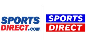
They have decided that 2021 is the year to rebrand themselves with a new name and new logo. They have dropped the .com from their name and brought blue and red stripes to create a more modern take. This is meant to represent a new turn for the brand to focus on their sport element keeping up with the brands that they supply in stores.

Talk to Us

Do you notice any key trends within these designs? Why are big businesses changing their logos now? Does your business need rebranding? Our team at Stone Create specialise in logos and will match exactly what you need to get the perfect logo for your brand in 2021.

Continue reading