
What is a Call to Action?
A call to action (CTA) is a phrase used in your content to encourage your audience to take some form of action.
It prompts them to engage.
That’s good because we want our users to interact with us.
Interaction can be achieved through some of the following:
- Downloading an eBook
- Signing up
- Subscribing
- Purchasing
That’s just four examples but the list is a bottomless pit.

Every time a user clicks through to your website they’re showing intent.
They’re intent on engaging with the content on your website.
It could be reading a blog post, buying a product, booking an appointment etc.
CTAs drive users from simply consuming your content to completing more meaningful actions.
A clear CTA indicates what you want your audience to do next.
They’re vital elements of your website and marketing strategy.
Why do some people ignore CTAs?
Calls to action are often misinterpreted and therefore neglected by people who don’t understand them.
This is a huge mistake.
Common excuses for not using CTAs include:
- fear of annoying customers
- the website user will already know what to do
- unaware of their significance
None of them are valid reasons to ignore calls to action.
An effective CTA is subtle and unobtrusive.

Apple’s calls to actions are clear but don’t affect the content.
They don’t interrupt you but you’re aware the call to action is there.
Try to ease calls to action into your website whilst making sure they’re prominent enough to stand out.
View your website in terms of an orchestra: it requires several instrument sections to create something amazing.
Calls to action aren’t the reason you buy a ticket but they are a crucial part of your website’s symphony.
You’ll find that calls to actions are often buttons and that clicking the button initiates the beginning of the action.
Clicking the button may download an eBook or take you to a sign up form.
CTAs are literally a call for someone to take action.
They can be anything and you see them all the time.
- ‘Download the eBook’
- ‘Sign up here’
- ‘Join the group’
- ‘Buy now’
Let’s delve a little deeper…
How To Choose Your Calls To Action…
It’s all about your website’s goals.
Your website’s purpose isn’t just to sit there and look pretty. It may well be amazing to look at but you should have greater plans for it.
Your website should drive conversions.

Before you go anywhere near call to actions, you need to determine what it is you want your website to do.
Do you want people to:
- submit a form?
- purchase a product directly from the site?
- reach a certain page?
- watch a video/read a blog?
There are plenty of other common conversion goals too – these are some of the main ones though.
Calls to actions are text buttons that prompt the reader to take steps towards completing your website goals.
They are imperative if you want to see success with your website.
If they’re out of sync, you’ll miss the mark.
Put together your own list of how you’d like your website to work for you.
Convert these goals into calls to actions and take users down the right path.
Why should you use CTAs?
Calls to actions are necessary components of your website. Fact.
You’ll see far more success and higher conversion rates if you include them on your site.
It’s like baking a cake without sugar.
When it’s finished it will still be a cake – it just won’t be as good to eat.
You can build a website without CTAs, but it won’t do as well as it could with them.
Here’s why:
CTAs tell the customer what’s next
A CTA conveys what’s next for a customer.
You’ve got them to your site, they’ve consumed your content, now what?
CTAs remove any uncertainty regarding their next move.
There’s a certain direction you want them to go in. CTAs drive your users up the right road.
CTAs alleviate funnel friction
You don’t want to slow your customer down when they’re making their way through your sales process.
CTAs allow for a fluid transition between a prospect consuming website content and actually converting.

Not using CTAs may confuse the user and cause them to abandon your process.
Make your website as simple to operate as possible.
Calls to action make your website easier to use.
Increase your digital success
Your digital success is defined by your return on investment.
Using CTAs increases the number of conversions you’ll see on your site.
The more conversions you get, the more success you’ll see.
Check out this travel blog website.
A Three-Step Call to Action Formula
Calls to action aren’t the easiest puzzles to solve.
Assembling the various pieces can take time.
Use the formula below for help on how to make a call to action.

The way you design, write and position your CTAs should align with your website and its goals.
All three should represent a cohesive effort towards your targets.
Where should I put a call to action?
You should have multiple CTAs on every page.
This is a must.
Of course, bombarding your visitors with CTAs will do more harm than good – so don’t do that.
Certain places on a web page are better than others for giving CTAs high exposure.
Higher exposure, more clicks.
Here’s an interesting point to note:
Gutenberg suggests right
If you’re not familiar with the Gutenberg Rule, check out the images below.
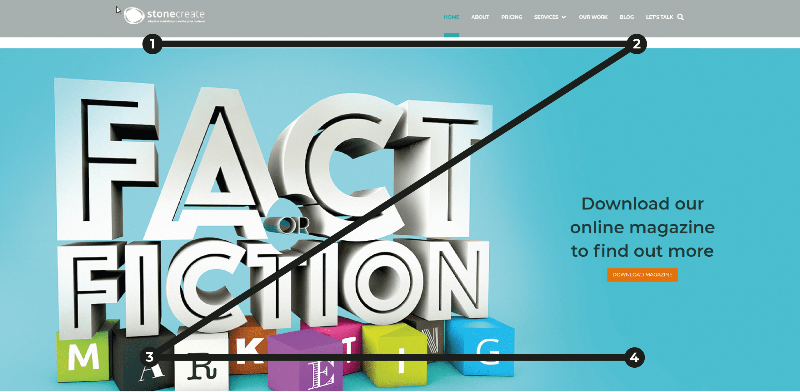
The Gutenberg diagram is based on the Western habit of reading left to right.
Spots 2 and 4 are the prime places for you to include a call to action.
Always place your calls to action to the right of the page.
It bores from the Z pattern theory.
Have a look at a more detailed graphic here:
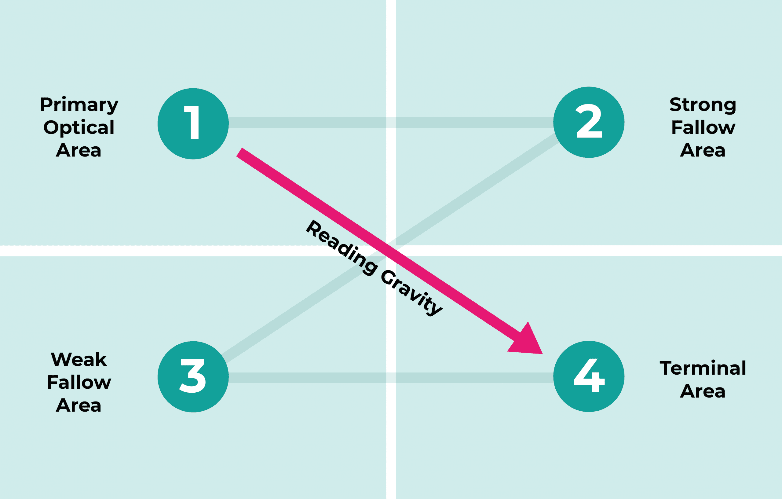
The ‘strong fallow’ and ‘terminal’ areas are optimal positions for calls to action.
These are areas where the reader will stop and so are the best places to add your CTAs.
The terminal area is thought to be the best place for a call to action because the user has to decide what they’re going to do next here.
A call to action pushes them towards a decision.
How to design an effective call to action
Your call to action button is there for clicking – that’s your goal.
So as well as placing it in a prime spot, it also needs to look great.
It must stand out.
Here’s some things to consider:
Colour
Considering colour of your CTA button is important.
It must be different to its surroundings so that it can be easily noticed.
Some colours are more enticing than others though.

Here are some of the most appropriate colours for your call to action button:
- Red (passion, excitement, urgency)
- Green (nature, psychology)
- Orange/Yellow (warm)
The worst colours are black, white and brown.
Steer clear of them if you can help it.
Shape
What shape is your CTA button going to be?
Is your button going to be square or circular?
Or rectangular with rounded corners?
According to research, rounded edges are the way to go.
Similar to the image below:
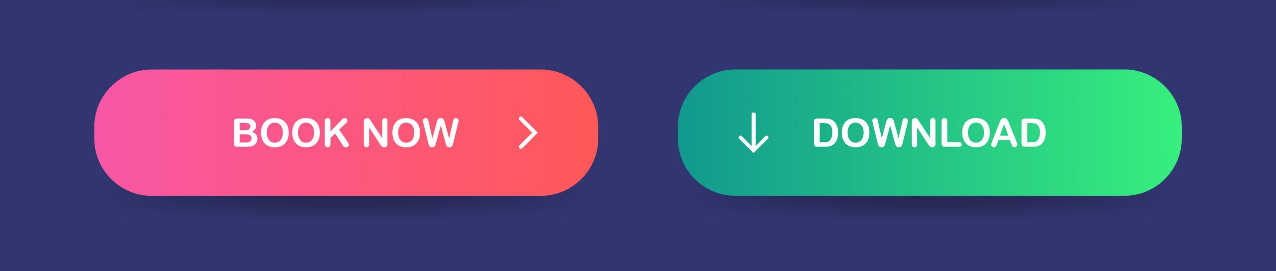
Rounded edges are better for three reasons:
- The corners point now point inwards and place emphasis on the text inside.
- As humans we’re programmed not to like sharp edges so take better to rounded corners.
- Round edges take less effort for our brain to process.
Size
The perfect CTA size guideline doesn’t exist.
Your CTAs need to stand out but remain unobtrusive.
Try different sizes and ask other people for their opinion.
Make it too big and it’ll seem forced and invasive.
Too small and you risk it going unnoticed.
You need to find the sweet spot in the middle.
Be different
Make your CTAs stand out.
If your button blends in with the rest of your content, users won’t easily distinguish it from the rest.
When considering the shape, size and colour, try being inconsistent with your brand.
Different draws attention.
How to write your call to action
So your call to action button looks great.
You’ve found the perfect place to put it on the page.
And it’s soon going to direct your users to a superb landing page.
But what is it actually going to say?
Here’s how to ensure your call to action copy slays:
Use strong verbs
This is a rule of writing in general, not just writing call-to-action copy.
Strong verbs entice users.
They’re more powerful and incur action.
Weaker verbs, such as state-of-being verbs, are passive and won’t drive people to take action.
Add information
What will happen as a result of a user clicking your CTA?
What will they get?
Are there benefits to clicking it?
Answer these questions in the copy surrounding your CTA.
Take a peek at the example below.
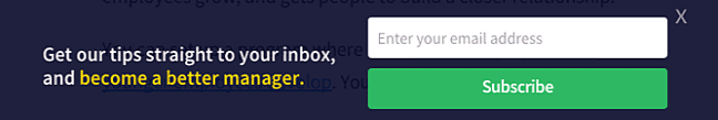
If you click ‘Subscribe’, you’ll receive email tips.
The tips will boost your management skills.
If you’re looking to improve yourself as a manager, this call to action is irresistible.
It’s not vague and the user knows what they’re getting.
Use FOMO
FOMO is the ‘fear of missing out’.
It encourages the user to take action quickly.
Use phrases like:
- Buy now while stocks last!
- Order now! Limit availability!
- Get yours today! Stock running low!
Consumers always like to take advantage of good deals.
Creating a sense of urgency is a powerful technique to boost the impact of your call-to-action.
Two Top Tips For Your Call To Action
Here are some general rules of thumb to remember when creating your calls to action.
Don’t assume your audience knows what to do next
If it’s unclear what the user has to do, it’s likely they’ll do nothing at all.
Calls to action are ways of prompting the user in the direction you want them to go.
Your audience won’t always be clear on where they want to end up.
Your call to action should give them a route to follow.
Try split testing
Test different calls to action to see what works best.
Try different designs.
Position them in various places.
Change the wording.
Record how many times users reach the landing page.
And of course how often they convert.
Summary
Calls to action are vital in your copy.
Not just on your website but in all communications with your business’s audience.
Call to action best practices:
- Test different calls to action to see what works best.
- Use the CTA formula to maximise the potential of your copy.
- Place calls to action to the right of the web page.
- Include calls to action on all pages of your website.
For more information on calls to action, send us a message on Facebook.
To book a marketing meeting with us, fill out a contact form below.
